The next chapter of Archlet

Archlet levels up: A new identity for the next era of eSourcing
When we started Archlet, our goal was simple: make sourcing easier. We had seen too many teams get stuck in spreadsheets, approvals, and tools that slowed them down instead of helping them move forward. We ourselves worked with systems that frustrated us - they made simple things complicated. That frustration turned into motivation to build something different: a tool that works the way people actually work, fast, transparent, and collaborative.
A few years later, that idea has grown into something much bigger than Jakob, Lukas and I ever imagined. Archlet has evolved from a sourcing optimization engine into a complete end-to-end eSourcing platform used by some of the world’s leading companies, including Walmart, TotalEnergies, Estée Lauder, and PepsiCo. Our customers now run everything from simple RFQs or RFIs to complex strategic sourcing events and eAuctions, across all categories, all in one place.
Just in the past quarter, we welcomed more than ten new customers and are on track to more than double our revenue in 2025. The product matured. The customer base scaled. And with that, expectations changed - from our customers and from ourselves.
But our brand still looked like it did in the early days: friendly and playful, but not quite matching the maturity of the business we’ve become and the global impact we’re driving every day.
A new Archlet
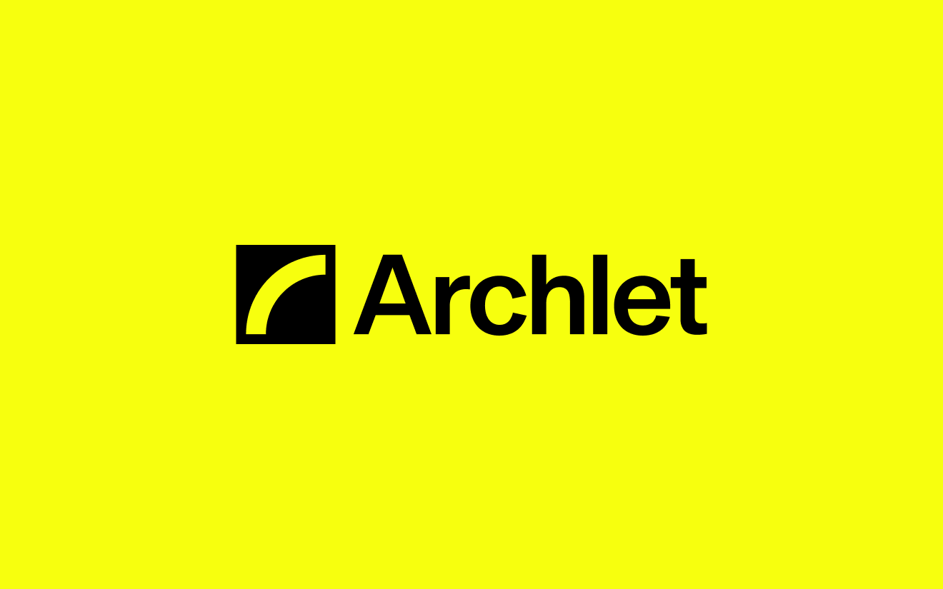
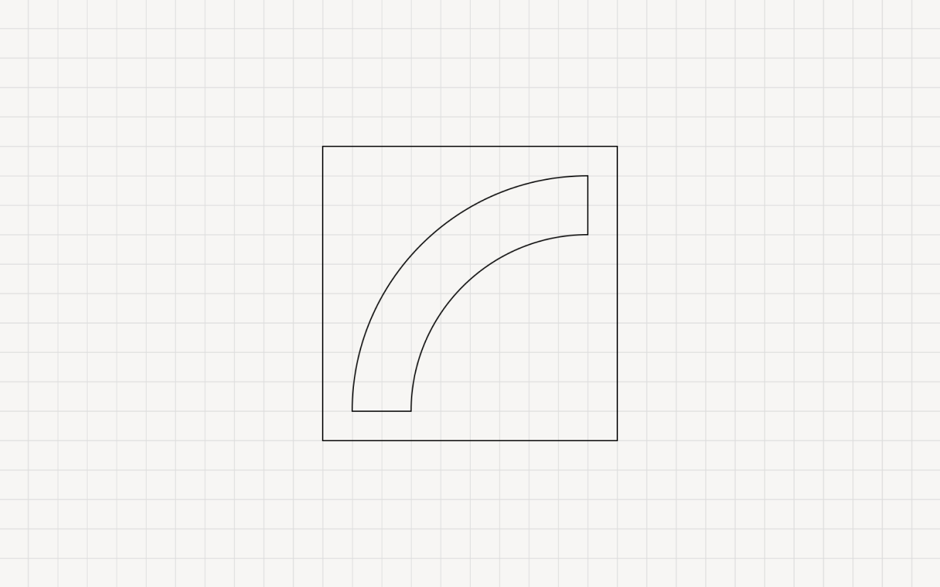
So we decided it was time for our identity to grow with us. You’ll notice our logo now starts with a capital A - a small but symbolic change. The “a” grew up with us. The Arch stays, of course, but it’s cleaner, more balanced, and better represents the platform we’ve built. Still recognisably Archlet, just the next chapter. And yes, it also looks a lot less like a bone. We’ve heard that one more than once.
Built on the bridge
Our new identity is built around a simple idea: Archlet is a bridge. A bridge between procurement and suppliers, between complexity and clarity, between the old way of doing things and what’s possible now. And yes, that’s also where our name comes from. When we started Archlet, we wanted something that stood for connection and structure - the arch as the bridge that brings everything together.
This isn’t just a new logo or a new set of colours. It’s a reflection of how far we’ve come and where we’re heading next - as a partner helping procurement teams source smarter, move faster, and with more confidence. We’re grateful to everyone who’s been part of this journey and helped make Archlet what it is today. We’re excited to see where we can take it from here.

